Make Power BI Slicers Control Filters on All Report Pages
If you don’t necessarily want a Dashboard created from pinned tiles in your Power BI report, creating a Welcome Page on your report might be a good alternative. From here, with the use of a text block, a few important slicers, and a couple of colorful donut chart, you can make a nice presentation for your report consumers.
But there’s a way to make this Welcome page more than just a pretty face for your report: It can also control what your audience will see on each page. This can be done by syncing your slicers across all pages. To accomplish this, from the View Menu, select the Sync Slicer check box:
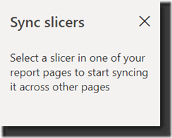
This will bring up the Sync slicers panel.
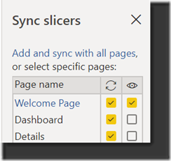
Now you can select each slicer on your Welcome page, and choose its behavior. You will have to do this one slicer at a time. You can simply sync the slicer only (left hand column with the refresh icon) or you can also show it on each page (right hand column with the eye icon).
From the below configuration, you can see that the Welcome Page both displays AND syncs the slicer, whereas the Dashboard and Details pages only Sync the slicer – it it not visible on those pages. Be careful not to hide the slicer on all pages, or you will lose it! (I found this out the hard way!
Happy Reporting!


