How to Add Banded Row Style to PowerApps Gallery
Hello, fellow PowerApp lovers! I made a great discovery today that helped really “up my game” in terms of visual appeal on a SharePoint list PowerApp. This was accomplished by added an alternating colors to each row in the gallery, allowing it to appear more like an Excel table, and making it much easier to read. Here’s how I did it.
First I selected the first row of the Gallery. You’ll know the row is selected by seeing all six circles on the border edges. I’ve highlighted these in red below so they’re easier to see:
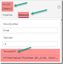
Next, I set the TemplateFill property of this Gallery row to a conditional statement:
If(Mod(Value(ThisItem.ID),2)=0, Color!GhostWhite, Color!White)
GhostWhite and White represent the colors I selected, but you can select any colors you wish.
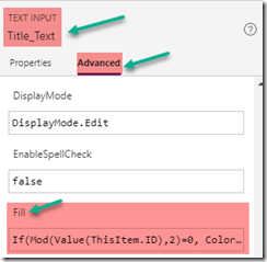
Now your gallery row will use alternating colors, but you will still need to do the same for each element you have in that gallery row. In my case, this is Title, Initiator, Created Date, Status, and Business Unit.
It’s also important to note that in order for the color to fill the entire row, you should have no space between your gallery items.
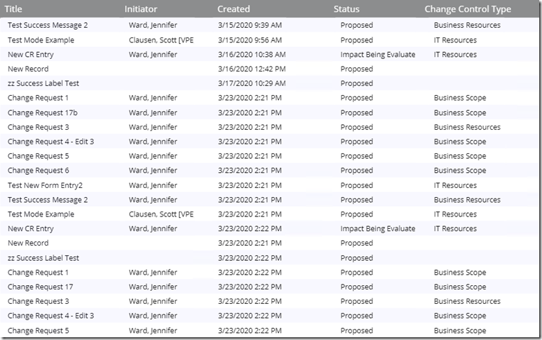
Once you do this, your gallery will show alternating bands of color, which is much more professional looking and easier on the eyes! Enjoy!


